Deyan Sudjic explains how – and why – the humble road sign became a design icon

By the end of the 1950s, when the first of the British motorways, the M1, was reaching its completion, the country’s road signs were a cluttered, incoherent mess. Kinneir’s starting point for finding a way to guide motorists was not aesthetic, but a search for clarity rooted in basic principles.“What do I want to know when I am trying to read a road sign at speed?” he asked himself. It wasn’t just what the signs looked like, but rather what was on them and where they were positioned.
What Kinneir and Calvert eventually came up with was a system of colours, symbols and sizes to guide traffic around even the most complex of road junctions. They used these to create sequences of maps for drivers to orientate themselves effortlessly. Today, their basic conception remains intact, still as modern and as relevant as it was half a century ago.
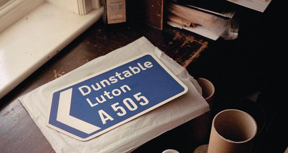
The pair believed a mix of upper and lower case letters offered the most legible combination and created a new typeface for them, a refinement of the more angular Akzidenz-Grotesk they named Transport. At the same time, they worked on a remarkable set of signs to signal hazards, such as level crossings and road works, and to caution drivers as they approached zebra crossings and schools. They were pictograms that come close to works of art rather than technical diagrams used on mainland Europe, or the florid British signs they replaced.
The results are masterpieces of clarity and elegance: now so ubiquitous they are almost invisible, yet an essential part of Britain’s identity – a tribute to good manners and an enlightened state patronage. These are qualities that make an example of Kinneir and Calvert’s work a crucial part of the Design Museum’s permanent collection. Their signage has a lot to say about so many aspects of design: from the basic concept of legibility to the emotional qualities that type can convey.
Deyan Sudjic is the director of London’s Design Museum


