We speak to British artist Fiona Banner about her Stamp Out Photographie exhibition at Whitechapel Gallery, which shines a new light on lesser-known classics

How did you go about selecting the artwork you wanted to include?
I’ve actually had the title of the exhibition in mind for ages; it’s something I stole from the Archive of Modern Conflict, a photo-based archive in West London that I’ve been working with. The first time I went there, I saw this poster with the words ‘Stamp Out Photographie’ and I took a photo of it and put it up on my studio wall. I enjoy that polemic, it relates to my own work as an artist. I play around with film and the photographic image through language and the verbal, always moving around the image, but not using it directly. Although I work with text, I haven’t rejected the image – I’m exploring my ongoing dysfunctional relationship with the photographic and filmic image.

“I suppose every gallery space is a kind of theatre for art, but here that is exaggerated through the lighting”
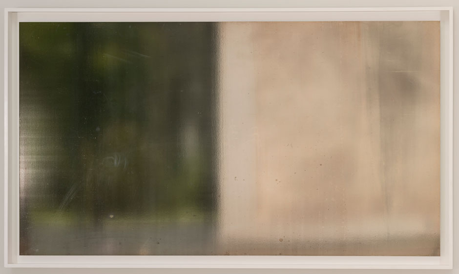
So, in choosing pieces to include in this display, I was exploring that relationship and thinking about different ways of seeing reality, and how we confuse reality with the filmic and photographic. I hadn’t seen any of the work in flesh until very recently, I selected all the works for this show from small, photographic Stamp Out Photographie printouts. That was how the engagement started, and the final staging of the works references that. It’s a show about the printed image – or the image as reference versus the actual image and the slippage between the two – in our understanding, and in our perception.
How did you go about that?
For this exhibition, I’ve transformed the gallery into a theatrical space. I suppose every gallery space is a kind of theatre for art, but here that is exaggerated through the lighting. Instead of the works being evenly lit, the lighting constantly changes from cyan, magenta and yellow to black, so your perception of the works is constantly manipulated. The light in the room refers to the colour system associated with printing: CMYK. Also within that the works go from visible to hardly visible at all. It sets up a perceptual game.
On paper the works sound very disparate, coming from different times, movements and locations. How did you find a way of logically connecting them?
There’s a dialogue between the works themselves and the characters featured. For example, there’s this huge portrait of Picasso by Rudolf Stingel, which is in conversation with Andy Warhol’s portrait of Jackie Kennedy within the display. The characters kind of create this alternative dialogue, which isn’t at all curatorial in the formal sense. Like I said, it’s a performance space so perceptions are constantly changing and that’s concentrated by the ever-shifting lighting and by this great soundtrack by Russian artist, Olga Chernysheva. It’s very theatrical and filmic.
So the works are all connected?
Yes, in a way. In this environment they all speak of the theme, which is universal and eternal. The oldest image is the Monet, the daddy of impressionism, which seemed to be the very beginnings of fracturing images and binding them in new a new language – the language of perception. Then there’s the Gerhard Richter piece, which is much more recent, but again there’s this ongoing interplay or conversation about the image, about gender and about photography. All the displayed art asks similar questions. How do works or images exist in our perception and memory? How do our minds alter reality? How do our eyes alter reality? Those questions, and the relationship to photography, is so strong that it almost overpowers the actual work.
We’re very familiar with many of the images on display because they’ve been reproduced in the media, or they’ve entered into popular culture. The Richter piece, Kerze, was used as an album cover for Daydream Nation by Sonic Youth. How does that affect the way we view those particular artworks? There’s a struggle for an authentic moment, an original moment with viewing artworks, but really we do not know what that is.
What are some of your favourite pieces from the display?
Well, I’ve never really understood Christopher Williams’ work. I’ve always been drawn to it for that reason, so it’s good to spend time with it in person and not through a computer screen. The big portrait of Picasso is just so interesting because it’s such a large image of a famously small man. It’s also surrounded by the myth of the artist and the history of the photographic portrait.
It’s hard to choose my favourite because, as the space is constantly changing, the images are never in a clear light. Nowadays, photographs are like words or air – there’s no materiality or stability and I think that is reflected in how I’ve dealt with the environment. It’s like the whole exhibition is a moving picture.
Stamp Out Photographie runs at Whitechapel Gallery until March 2015
![Bridget-Riley-Stretch-1964[2]](https://storage.googleapis.com/s8partner-pm_wp/1/2014/12/Bridget-Riley-Stretch-19642.jpg)


