In the Blink of an Eye

Noor Riyadh’s 2025 programme reflects a city in flux. From Al Faisaliah Tower to metro stations, 59 artists respond to Riyadh’s architecture, movement and rhythm with light as a connective medium

Shinji Ohmaki: Liminal Air Space-Time. Photo Noor Riyadh 2025

Noor Riyadh is a citywide light art festival that reshapes how Riyadh looks and feels after dark. Led by director Nouf AlMoneef, it spans metro stations, public squares and heritage districts, turning familiar sites into installations that respond to the city’s pace and scale. Launched in 2021 under Riyadh Art and the Royal Commission for Riyadh City, it has become what’s considered the world’s largest light art event, presenting more than 550 works by 500 artists and drawing over nine million visitors. Its aim is to commission public artworks from Saudi and international artists and to use light to connect Riyadh’s cultural and urban zones. For 2025, curators Mami Kataoka, Sara Almutlaq and Li Zhenhua work under the theme In the Blink of an Eye, a reference to the city’s rapid development.

This year’s edition – which closes on 6 December – features 60 artworks by 59 artists from 24 countries, including 35 new commissions. László Zsolt Bordos’ Astrum turns Al Faisaliah Tower into a real-time planetary compass, its 7km laser beams mapping celestial movement. At KAFD Metro Station, Vali Chincișan’s The Vision Grid converts the facade into a shifting lattice of colour and sound. Christophe Berthonneau’s Synthesis, made with Bordos, merges drone choreography and architectural mapping so a building appears to lift and reassemble itself. fuse*’s Luna Somnium builds a large-scale metal framework animated with lunar data. James Clar’s When the Sky Reaches the Ground (a moment frozen) suspends a sculptural ‘lightning bolt’ made of neon and scaffolding. Saudi artists include Fatma Abdulhadi, whose fabric-based Keep your eyes on the light: Into Another Garden explores shadow and reflection, and Ahmad Angawi, whose Algorithms of Light: The Falcon draws on Najdi Sadu patterns and falcon iconography. Alex Schweder’s Clockwise Invitations is an inflatable environment that expands and shifts with its visitors.

Since its early editions, Noor Riyadh has grown into part of the city’s cultural infrastructure. Below, AlMoneef discusses the festival’s evolution, the logic behind its six hubs, the criteria shaping artist selection, and the moments she hopes visitors notice.

Fuse: Luna Somnium. Photo Noor Riyadh 2025

Port: You’ve been director of Noor Riyadh since its early editions. What does this iteration feel like to you personally, and what is it trying to do differently?

Nouf AlMoneef: Every edition carries its own identity, but In the Blink of an Eye feels especially close to the current spirit of Riyadh. Since the festival launched in 2021, I have watched the city transform at remarkable speed. This year reflects that momentum in a very direct way. It brings light into spaces that express both our heritage and our modern urban rhythm, while placing even greater emphasis on accessibility and public experience. What feels different is the immediacy. The festival responds to a city that is constantly shifting. Light becomes a way to pause, notice change, and reflect on how quickly our surroundings evolve.

How would you describe this year’s theme, In the Blink of an Eye, and how did it shape your approach to the programme?

The theme captures the pace of Riyadh’s transformation. It speaks to how rapidly life is moving, how innovation shapes our environment, and how perception can change in a single moment. Light naturally conveys speed, energy, and transition, which made it the ideal medium for this edition. The curatorial team, led by Mami Kataoka, with Sara Almutlaq and Li Zhenhua, explored these ideas through artworks that shift, react, or transform as audiences move through them. The theme shaped the programme by encouraging artists to experiment with perception, memory, and the movement of the city around us.

Encor Studio: Sliced. Photo Noor Riyadh 2025

The festival spans historic and emerging zones across the city. Can you tell us about these locations and how you decide which works go where?

Noor Riyadh 2025 unfolds across six hubs and locations: Qasr Al Hokm District (Hub), King Abdulaziz Historical Center (Hub), stc Metro Station (Hub), KAFD Metro Station, Al Faisaliah Tower, and Riyadh Art Hub at JAX District. Each carries its own narrative and atmosphere. In the historic areas, artworks interact with architecture that holds the city’s memory. We look for installations that respond to heritage through material, scale, or rhythm. In the metro stations and contemporary hubs, the focus is on movement and modernity. These environments naturally lend themselves to works that explore data, sound, flow, and digital expression. Placement is always intentional. We consider the artist’s vision, the spatial character of each hub, and how the overall journey will feel as visitors move between traditional and modern spaces.

This edition presents 59 artists with more than 35 new commissions. What criteria guided the curation?

The selection balanced several key considerations. Alignment with the theme: every work needed to respond authentically to the idea of rapid transformation and shifting perception. Diversity of international and Saudi voices: artists represent 24 nationalities, including a strong Saudi presence that reflects the country’s evolving creative landscape. Innovation in light-based practice: we invited artists who experiment with technology, kinetic movement, or immersive forms of storytelling. Sensitivity to site: each commission had to fit its location, whether a historic street or a fast-moving transit hub. Public experience: the festival remains open and free, so works are designed to be intuitive, welcoming, and engaging for all ages.

Shinji Ohmaki: Liminal Air Space-Time

If you had to highlight two or three works that capture the heart of the festival, which would they be, and what moments do you hope audiences notice

Several works express the essence of this edition. The commemorative installation for Safeya Binzagr is a tribute that honors a pioneer of Saudi modern art. It connects the past to the present and invites visitors to reflect on the legacy that shaped today’s creative momentum. Ayoung Kim’s installation at Riyadh Art Hub at JAX District: her work explores shifting temporalities and cultural cosmologies through light and movement, inviting audiences to reflect on different ways of perceiving time. New commissions from artists such as James Clar or Muhannad Shono explore perception and identity in ways that resonate with the theme and the atmosphere of the city. What I hope people notice are the subtle details. The way light shifts against a facade, how a work responds when you walk past it, or how an installation transforms a daily commute into an unexpected moment of reflection.

Noor Riyadh is often described as a point where art and technology meet. How do you see advances in light-based technology reshaping public art?

Technology broadens the possibilities of public art. Tools such as AR, AI and advanced projection systems allow artists to work with movement, interaction and environmental data in new ways. These tools also enhance emotional connection. They can turn a metro station into an immersive landscape or translate the rhythm of the city into light and sound. What matters most is not the technology itself, but how it deepens the experience. When used thoughtfully, it helps audiences feel more connected to their surroundings and to the stories we want to share through the festival.

Encor Studio: Sliced. Photo Noor Riyadh 2025

How has Riyadh’s art scene evolved in recent years, and what role has Noor Riyadh played?

Riyadh’s cultural ecosystem has expanded significantly. New institutions, public art programmes and creative platforms have helped build a vibrant artistic landscape. Noor Riyadh has supported this growth by presenting large-scale light artworks in public spaces and by inviting both Saudi and international artists to engage with the city. Since its launch, the festival has presented more than 550 artworks by over 500 artists, attracting more than 9.6 million visitors and spectators. The community engagement programme – including workshops, school visits, talks and guided tours – has also been important in creating new art enthusiasts and building long-term cultural curiosity.

Looking ahead, how do you hope Noor Riyadh will evolve? What ambitions or challenges feel most urgent for its future?

I hope the festival continues to grow in a way that reflects the evolving character of Riyadh. The ambition is to expand the breadth of light-based creativity, support more Saudi talent, and keep strengthening the connection between the public and the city’s artistic identity. As Riyadh develops, one of the key challenges is to ensure that public art remains accessible and meaningful. We want Noor Riyadh to stay rooted in inclusivity and to offer experiences that resonate with residents and visitors alike.

Ultimately, the goal is for the festival to evolve in step with the city, providing new perspectives on Riyadh’s changing landscape and inviting people to experience its transformation through light.

Noor Riyadh runs until 6 December, find out more here

Fuse*: Luna Somnium. Photo Noor Riyadh 2025
Zhang Zengzeng: The Light To Home. Photo Noor Riyadh

Material Language

Samuel Ross speaks on TRANSPOSITION, his immersive installation for The Balvenie at Milan Design Week, and how craft, emotion and experience shape the next chapter of his career

TRANSPOSITION: Samuel Ross x The Balvenie ®️ Francesco Stelitano

Last year, Samuel Ross entered a new chapter. Having sold his stake in A-COLD-WALL*, the designer and artist began what he describes as a renewed decade – an ongoing recalibration of identity and output. “It’s an interesting time where everything we’ve built as a sense of identity is tied to this idea of youth,” he tells me. “As soon as you leave that – which is at age 30, I believe – it’s: who actually are we? And we almost have to rediscover, re-articulate ourselves.”

It’s a perspective that’s stayed with me since we last spoke for a profile in Port’s sister magazine, Anima, and one that resonates more deeply now as I also enter my early thirties. For Ross, renewal is more than a shift in mindset. His trajectory has moved steadily from graphic T-shirts to institutional exhibitions, from the language of streetwear to that of sculpture, painting and now, immersive spatial design. And yet the foundations remain the same: self-sufficiency, tenacity and an obsession with material. “The idea of work-life balance feels absurd to me,” he says. “The work is inseparable from who I am.”

His latest commission, TRANSPOSITION, encapsulates that ethos. Developed in collaboration with The Balvenie and unveiled at Milan Design Week 2025, the large-scale installation transforms the atmospheric Old Foundry in Milan’s Isola district into an abstract sensory environment. The site-specific work marks the first partnership between The Balvenie and Ross’s studio, SR_A, and draws on elements from whisky making – copper, oak and flowing water – as well as The Balvenie’s dedication to craft. Upon entering, visitors are greeted by a gust of wind infused with floral and earthy notes. Cascading water sounds fill the space, forming a natural rhythm alongside soft, percussion-less music. It’s a tactile experience, housed within exposed concrete and steel, where every sensory element, from mist to material, has been carefully orchestrated.

The installation also aligns with the release of The Balvenie Fifty Collection, a rare three-part series of aged single malts that celebrate five decades of craft. Like the whisky it honours, TRANSPOSITION is measured, deliberate and layered. “How do we offer people something they can’t experience online?” Ross asks. “It’s really leaning into this idea of performance, installation and runway, to deliver something worth visiting.”

In this Q&A, Ross reflects on the making of TRANSPOSITION, how the definition of the craftsperson is evolving, and what this new phase in his practice looks like – one that’s matured, sharpened and entirely self-defined.

The Balvenie x Samuel Ross Artist Studio

So tell me, what stage are you at now?

There’s a space of economic freedom, which I’m super grateful for, because I spent the last 12 years working 14-hour days, every single day. That’s not changed. Work is all I do, and I couldn’t see another way of living where I don’t. I’ve always built companies or value and placed them into a market or a context or an institution. There’s never been this guise of provision coming from outside of myself. I have to establish the value in the market, which is a great affordance – to not have to run away from the work – because the work is inherently part of my identity. And the output, as we were saying, evolves and matures over time. Perhaps, arguably, you can say it’s moved from spray painting a T-shirt to abstraction in the metal at the V&A. There’s been a development. But the way of producing work hasn’t necessarily changed.

Do you think you have a healthy work-life balance?

No, probably not. I sleep well. If I feel like I have a mental block or creative block, I’ll go to the gym or I’ll paint as an unlock mechanism. But fundamentally, I’m aware my entire life is dedicated to producing emotional works that will go out into the world. And I couldn’t think of a better, more fulfilling practice.

Are you still doing your painting?

Indeed. I have a solo show at the moment at SCAD Museum of Art, which went live last month. It’s my first American survey of an institution. It will sit there for about six months, and they’ve just acquired three pieces of work, which is fantastic. 

It’s the first time that there’s been a survey of the work between garment, sculpture and painting in a single space, which is very exciting, because it gives an opportunity to see the cohesion between the work. And I was saying earlier to another member of our crew: it just takes a series of years to establish continuity across the disciplines. And finally, that’s now quite palpable.

Would you say that’s the definition of success?

I think that’s for other people to determine. But I feel there is a sense of synergy and cohesion between the messaging, the storytelling, and the application of the work – whether it be the aesthetics, the materiality, the scale, context, the potency. I know where I sit within the dichotomy of the arts, and it’s a place I want to continue to establish further.

TRANSPOSITION: Samuel Ross x The Balvenie ®️ Francesco Stelitano

You’ve talked a lot about craft as something inspired by your family and your parents. Do you think the definition or purpose of a craftsperson has changed over time? 

I feel over the past decade we went through a spur of growth when it came to expression and creativity, whether it be luxury consumer goods or new artists entering the canon. There’s always a delicate dance between leveraging a moment of growth and ensuring we’re still making the right decisions with the work. Arguably, now the market is just adjusting and restabilising, which gives artists more time to really think about the work being put out there.

And bring more traditional techniques and methods of making to the fore?

Yeah, I agree. Now, the artist’s practice ideally has more time to think about what value they bring to the market. It might be the extension of a particular movement. Like for myself, it was looking at Black British abstraction, seeing there are so many missing holes or cavities within the canon, but still being quite discerning about what I have to offer to that canon. For me, it was about material – like including volcanic ash from the Caribbean islands my family hails from, with turmeric and ink and pigment and honey – to offer a new material composition within the lens of abstraction. That was the research that occurred over the past few years. And from a craft standpoint, it’s also about the quality of craftsmanship in the maker. With some of the partnerships we’ve structured through SRA, we only work directly with families who are still involved in the running of their organisations and companies. It’s typically a value proposition tied to learning how ateliers and maisons function. Because fundamentally, I want to build a maison from SRA across the next 10 to 15 years, which will sit parallel to my practice. But as a company, it will take on the behaviours of a maison.

How would you define that? 

There are modern versions of maisons now which are really interesting: the Byredo that Ben Gorham has established, or 1830 L’Officine Universelle Buly that Ramdane Touhami has recontextualised and grown. Those are the two I look at, because they have a new tilt on what European luxury looks like for a particular generation. Perhaps they’re closer to Gen X, but as a millennial, I’m searching to determine what that can be for our generation. The beauty of the maison model is that it takes time to establish it, which means you have less pressure to bring your ideas to market.

The Balvenie x Samuel Ross Artist Sketch

In terms of the installation for The Balvenie, you mentioned you like to bring in new materials or unexpected mergings. Do you think you’ve achieved that with the installation? 

When it comes to spatial installations, you have a few different KPIs to establish. One is that the main actor in a commercial partnership needs to be the product itself. Hence why there’s such a focus on the animation of water and this idea of different stages of the fermentation and distillation process leading to whisky from a raw mineral well. Particular aspects are quite clear to understand. When it came to material – after visiting Dufftown – the focus on patinated copper and lacquered oak were two extractions brought into the install here. But also, as an artist, you’ve got to be gracious to the resources each partner has to put forward. There’s a dance, always pushing to articulate things well. Each partner has a different capacity for what can be delivered. If we think about Kohler last year, for example, you could imagine the capacity put forward there was in the millions to establish such a grandiose approach. When you’re dealing with private European companies, it’s a much more delicate and intimate process and output. In this instance, it was more about delicacy and intimacy – not necessarily pushing The Balvenie into a distortion through a heavily abstracted environment with lots of plastics and a postmodern building. That wouldn’t make sense for The Balvenie. If I think about The Balvenie, I think about procurement, almost –  finding ways to bring installation in, but also preserving and making sure there’s a sense of comfort. It’s the first time the brand has ever been introduced in that way.

It’s very intimate. And I think what elevates that is the sensory experience.

When I think about performance art and installation, it’s more about what can be conveyed in person that can’t be conveyed digitally. How do we drive people to the space? And if they are coming to the space, how do we offer them something that can’t be online? It’s light, temperatures, the animation of water, the flex of the water, the mist according to the body, the temperature shift and the scent. It’s really leaning into this idea of performance, installation and runway, to deliver something worth visiting.

The Balvenie x Samuel Ross Polaroid

Do you think that installations therefore need to have that performative element? I’m aware you often apply that to your work. 

I think back to runway shows at A-COLD-WALL*, where we had misters dispersing water onto models and the audience, or models running through black water. This idea of installation and performance and environment comes down to a love of public art. How do you enamour the public with emotion first? It’s interesting – when you sit between this weird gorge or blur between design and art, there has to be enough intent with design. It’s always the assertion of justifying, justifying, justifying – because there’s typically a clear conversion point. Whereas within the arts, it is much more of a Jungian or psychedelic experience of being arrested by an emotion or a reality on behalf of the artist. And with spatial installations, you’re mediating the two, finding a way to bring them together.

A psychedelic experience – I love that. So is that how you expect or hope visitors will experience it? To walk in and have a psychedelic moment of respite?

I think it’s more that they enter the space and the temperature drops, and the acoustics delivered from the water – that sense of percussion and animation, which dances quite well with the soundtracks playing within the space – offers them respite in the midst of the city. There’s enough abstraction of what you expect from a corporate partnership offered from that experience, but it still supports how special and potent the whisky is itself, through the volume of water being presented.

TRANSPOSITION: Samuel Ross x The Balvenie ®️ Francesco Stelitano

Do you think you’ll continue working in this space, that being collaborations with alcohol brands?

I think it’s pretty interesting. Before we go into any category, I do a lot of R&D – who else has activated the space historically? And I think with the maturity of my career moving forward, these are the keystone moments that define an artist’s impact on a generation. You’ll do an alcohol partnership with some kind of synchronicity, whether it’s Gary and Hennessy, or Murakami and Hennessy, or Futura and Hennessy, or Virgil and Moët, or Kim Jones and Moët. It’s a space artists consistently inhabit. Historically, artists and alcohol partnerships lead to artistic commissions. It’s actually just a part of the creative economy. We’ll stay within that remit. This will expand and tour – potentially globally – which is great. North America and APAC are currently on the cards.

Congrats!

It’s just been an incredible, incredible process. It’s the first moment of many to come, and you’ll see this really start to scale up and take new forms.

Gucci Bamboo Encounters

At Milan’s Chiostri di San Simpliciano during Salone, Gucci presents seven artist and designer commissions exploring the possibilities of bamboo

Queues of suave, sunglasses-clad people snake down the street. Gucci bags of all shapes and sizes are strapped to arms like prized accessories in a fashion safari. It’s packed, of course – it’s a Gucci event during Salone, and everyone wants a peek (or a selfie, depending on the mood).

Gucci’s Bamboo Encounters, staged within the cloisters of Milan’s Chiostri di San Simpliciano until 13 April, is a sensory shift from the surrounding frenzy. Here, bamboo shoots sprout through gravel beds; strange forms hang from ancient walls; light glows softly against decaying frescoes. It’s part serene sanctuary, part design daydream. Everything on show explores the symbolic and structural significance of bamboo – its legacy rooted in the 1947 Bamboo Bag, and its future imagined through seven very different artistic lenses. Curated by Ippolito Pestellini Laparelli of architecture and research studio 2050+, the exhibition shows the strength of bamboo as a sustainable resource and a medium through which to think about ecology, craft and collective memory.

Bamboo is something of a design shapeshifter. It’s fast-growing, lightweight, surprisingly strong and endlessly versatile. It’s these qualities that have made it a favourite across disciplines, from scaffolding in architecture to slatted chairs in sun-drenched courtyards. In interiors, its warm tones and natural texture lend a calming, almost meditative quality to a space. Think spa energy, but with structural integrity. In fashion, bamboo fibres are spun into fabrics prized for their softness, breathability and gentle touch on the skin. Perfect for the kinds of garments no one sees but everyone appreciates (underwear, socks, T-shirts). Its moisture-wicking, antibacterial properties even make it fit for the gym, if you’re so inclined. And with low water needs and zero pesticides, bamboo ticks all the sustainability boxes, which is even more proof that going green doesn’t have to mean going drab.


Gucci’s pioneering use of bamboo began in 1947 with the creation of the Bamboo Bag. During the post-war period, traditional materials were scarce, prompting Gucci’s artisans to explore alternative resources. They discovered that bamboo could be heated and bent into a durable, curved handle, leading to the birth of said Bamboo Bag. This design addressed both the material shortages and also introduced a distinctive aesthetic that became synonymous with Gucci. Over the years, the Bamboo Bag has been reimagined in various forms, maintaining its status as an emblem of Gucci’s heritage and artistry.​

So across the must-see exhibition, bamboo’s versatility is explored at length – at times poetically, elsewhere with precision-engineered resolve. Swedish-Chilean artist Anton Alvarez, known for his eccentric machines that extrude colourful furniture from string and glue, presents a bronze fountain inspired by the watery ecosystems of bamboo forests. The piece carries his signature logic of mechanical improvisation while evoking the meditative rhythms of a garden spring. It’s a play between man-made process and natural flow, and utterly meditative.

Dima Srouji, a Palestinian architect and founder of Hollow Forms Studio, contributes a quietly powerful installation combining found bamboo baskets with hand-blown glass forms made by artisans in the West Bank. Her work often dwells on archaeological traces and material histories – and here, bamboo speaks to fragile geographies and the endurance of craft in politically fractured landscapes.

Dutch collective Kite Club, comprising designers Bertjan Pot, Liesbeth Abbenes and Maurice Scheltens, brings a lighter, wind-borne reading to the material. Their handmade kites float in the wind (on a particularly cloudy and breezy day in Milan, I might add). They’re sleek, aerodynamic and colourful, celebrating bamboo’s historical use in flight, but also its role in play, resistance and communal experience. Meanwhile, Vienna-based designer Laurids Gallée, who often fuses traditional techniques with high-tech materials, presents resin furniture that references the structural elegance of bamboo without mimicking it outright. His pieces, translucent and grid-like, glow faintly under light, hovering between sculpture and utility. 

Memphis Group alum Nathalie Du Pasquier, one of Milan’s most quietly radical figures, contributes PASSAVENTO – a layered installation of bamboo and silk panels that filter light like folding screens. Du Pasquier has always worked between disciplines, from painting to textile to industrial design, and this piece is no different: its opaque white translucent, structured and soft. Korean designer Lee Sisan, whose practice spans traditional craft and parametric design, debuts a set of aluminium furniture engraved with bamboo motifs. Her work often nods to the heritage of Korean joinery while also using modern fabrication tools. Here, the cold gleam of metal is warmed by rhythmic, almost calligraphic surface patterns, drawing out a contrast that’s hard to miss. 

Finally, design duo The Back Studio – comprising Eugenio Rossi and Yaazd Contractor – offers a neon installation that outlines the silhouette of bamboo stems in acid-bright tubes, suspended like botanical blueprints in space. Known for blending pop culture references with sculptural installations, their work here speaks to the tension between nature and artifice, and how tradition might be lit anew through contemporary eyes.

Together, the seven commissions within Bamboo Encounters form a polyphonic meditation on bamboo as a material and metaphor. It also provokes a splendid dialogue between Gucci’s historical use of bamboo and those working in the contemporary design landscape. So, by inviting artists to reinterpret this material, we see themes of sustainability, innovation and cultural exchange brought to the fore. Not to mention Gucci’s ongoing efforts to explore new creative horizons while, of course, honouring its rich heritage.

So if you haven’t already, best get in line – bamboo’s having a moment, and Gucci’s not about to let it pass quietly.

Bamboo Encounters is running until 13 April. Find out more about the event here.


Rewriting Histories

Gus Casely-Hayford, director of the forthcoming V&A East in London, speaks to Tavares Strachan about his ambitious work, reflecting on the past, the politics of invisibility, and his recent exhibition at the Hayward Gallery

Photography Davey Adésida

OK, imagine that I offered you an art pass – a pass that could allow you to travel to any moment during the last century, to be there for any culturally significant event of your choosing. Dinner with Matisse, Achebe? I can take care of it. Maybe tickets for Keith Jarrett’s Köln concert, or perhaps the final Elgar Cello Concerto of Jacqueline du Pré?

How would you use it? Perhaps you would be there for Miriam Makeba’s triumphant return to South Africa after the unravelling of Apartheid, or maybe join New York’s avant-garde at the legendary 1939 opening of Frida Kahlo’s inaugural exhibition at the Julien Levy Gallery? I might go to the opening of the 1937 World’s Fair in Paris, when Picasso unveiled Guernica – a vast canvas that graphically captured a moment of mass murder meted out upon a quiet Basque town, forging one of the most effective anti-fascist statements ever made. As women and children gathered in the central square on market day, between 170 and 300 civilians were eviscerated, vaporised by multiple aircrafts. It is a work that can suck the breath from your lungs.

And in an adjacent pavilion at that very same fair, the Norwegian artist, Hannah Ryggen, showed textiles of similar scale that made a similarly devastating impact. Ryggen focused on the Italian invasion of Ethiopia. In a series of extraordinary tapestries, she held an unforgiving mirror up to a Western world that had turned its back as a quarter of a million Ethiopian troops were slaughtered trying to defend their nation. Ryggen refused to let us forget that the world did nothing as 78,500 Ethiopian resistance fighters were killed during the occupation, as 17,800 Ethiopian women and children died in the bombing campaign, as 35,000 people lost their lives in concentration camps, as 24,000 men were executed after the war. When 300,000 civilians died in the aftermath, there was only a mild ripple of outrage, and little else. But then, there was Hannah Ryggen.

Two appalling acts and two utterly fearless creative responses to fascism. What must that have been like to witness? One of those rare, rare moments when art does not just reflect the ambient mood, it somehow becomes a prescient bellwether, it hints at things that are yet to come.

1937 might be a high bar, but I would argue that London, 2024, should be on our list too. 2024 has been a truly extraordinary year for the visual arts in London. In a year like 1937, when culture did not reflect our mood, it seemed to gallop ahead and shine a light for us to follow. Against a backdrop of global instability, of bitterly contested racialised-elections, of economic uncertainty, of populism and political polarisation – we were treated to some deeply affecting art. There was a moment over the summer in London when Yinka Shonibare’s exquisite Suspended States was at the Serpentine, The Time is Always Now had opened at the National Portrait Gallery, there was a James Baldwin season at the Barbican, Joy Labinjo bestrode the Camden Arts Centre, Zanele Muholi’s work graced Tate Modern, Ernest Cole at the Photographers Gallery, Nick Cave, Ghada Amer and Yinka Shonibare in Cork Street – and so it went on. Commercial, national, independent galleries were all celebrating artists of African descent. Not in a coordinated season, just a timely response of near ubiquitous programming: the British art establishment reflecting on long overdue questions of equity, race, identity and the legacies of empire. A moment when a whole sector simply said, we cannot continue to remain silent.

And amongst that astounding body of work spread across an unforgettable year, the practice of Tavares Strachan lingers in the mind. This is work that does that bigger thing of not just making us think, but encouraging us to dream. Strachan is an artist who understands history and emotional damage – he’s spent time not just mapping the past, but reflecting on how its shadow continues to corrupt and contaminate our world. And whilst his work is robust, disciplined, impactful – he somehow also gives us desperately needed comfort. He throws an arm around us. ‘We are in this together,’ encourages one neon text piece, while another states ‘You Belong Here’. And I believe him.

In February of 2024, the Royal Academy of Arts opened Entangled Pasts, Art, Colonialism and Change. In RA tradition, it was both a magnificent historical survey and formidable sweep of contemporary practice. But unusually for the institution, it was uncompromising in its confrontation of issues of empire, race, distorted narratives and pervasive legacies of that past. And as a greeting in the courtyard of Burlington House (a Neo-Palladian temple that houses the Royal Academy), in a spot that could be seen by anyone who walked or drove up Piccadilly, the curators sited Tavares Strachan’s The First Supper: an unforgettable reinterpretation of da Vinci’s enigmatic The Last Supper. In the The First Supper, an animated Haile Selassie sits in the space taken by da Vinci’s Christ – his disciples are Mary Seacole, Marcus Garvey, Harriet Tubman and other heroes and heroines of Black history – and the place of Judas is taken by Strachan himself. Life size, cast in bronze and finished in black and gilt, it is an astonishing object.

The First Supper (Galaxy Black) (2023) is a bronze sculpture by Tavares Strachan, measuring 85 1/2 × 365 5/8 × 105 1/2 in. Courtesy of the artist and Perrotin, from the Glenstone Museum Collection, Potomac, Maryland. Installation view in the courtyard of the Royal Academy of Arts. Photo by Jonty Wilde

When I ask Tavares why he chose to take the seat as Judas in this tableau, his answer surprises me. “Judas was born to be a traitor,” he says. It was his destiny – and yet, he was forever blamed for playing a preordained role in fulfilling Christ’s purpose. Christ’s message was about his own sacrifice, but Judas also had to sacrifice himself for the Christian narrative to be tenable. “What choice did Judas have?” Strachan asks. “I like thinking about him as a kind of hero. Without him, the crucifixion and Christianity do not really happen.” And that was the moment when I fell for Strachan’s work. This is art for the rest of us. This is art for those whose destiny was not to end up on the plinth; it is for those whose histories were conventionally not taught in schools or celebrated in traditional libraries. This is an arm around your shoulder – You Belong Here.

Strachan is an unusual man. Although his work is a vivid map of contemporary concerns, he is, in so many ways, of another age. He is the sort of complete artist-intellectual who would have been successful in the 16th or 17th centuries. He has worked in varied creative media from lost-wax bronze casting to drawing, from video to photography, from installation to fashion, with artworks sitting at the fascinating intersection of art, science and technology. As he beautifully puts it, “I need to think poetically about the world, but I also need to think scientifically about the world.” He is interested in how things work as much as what they mean and how they look and is keen to deconstruct our understanding of the things we take for granted.

You Belong Here (2014) is a mobile neon installation by Tavares Strachan that travelled down the Mississippi River via a barge as part of the Prospect.3 Biennale. 30 ft × 80 ft on 100-ft barge. Courtesy of the Artist. Photo by Joe Vincent Grey

But he is also an uncompromising explorer. His curiosity has taken him to the Arctic four times, he has travelled to the North Pole, journeyed to the bottom of oceans and is one of a tiny number of people who have been trained to leave the orbit of the earth and travel beyond the pull of its gravity. He even founded scientific research platform BASEC (Bahamas Aerospace and Sea Exploration Center) to develop the technologies to further satisfy his appetite for tackling these old-new frontiers. And as you might guess with Strachan, even the equipment and accoutrements that he sourced and designed for these expeditions was utterly exquisite and covet-worthy. And so, in 2024 he began to retail his BASEC wear as a clothing line. In London, it is stocked by stores like Dover Street Market.

Perhaps, at heart, he is a figure of the 21st century – a cultural cartographer, a collector, interrogator and investigator of histories, someone who questions the systems and accepts axioms upon which we base our understanding of the world. He is unafraid to suggest beautiful alternatives and build the knowledge systems and narratives to respond to the most telling questions of identity, history and race. Strachan dedicated a decade to creating a vast leather-bound volume that shines a light on the overlooked and forgotten areas of knowledge. He called it The Encyclopedia of Invisibility. As he explains, “I think it just started off with a very simple question: if everything in the world had somewhere to go, then where were the things that didn’t have a place?” This is a kind of fascinating query, but once probed, how could you not want it to be answered? “And then I just thought, what if the project grew and grew and grew? I didn’t imagine it would get as big as it has. Now, we’re 3,000-plus pages and over 17,000-plus entries.” And, of course, it is spellbindingly beautiful.

Strachan is an indefatigable force, voraciously taking on new and complex projects that sometimes require new training and knowledge or might even incur great personal risk. But almost everything he engages with seems to deliver astonishing output. “I am always making,” Strachan says, “and I think that if I didn’t have those outlets, maybe some of that impetus to come up with stuff might manifest itself in my mental health. So, I will just keep making things up, even though there’s nothing to make up.” And perhaps that empathic, beautiful, contagious drive is why one of Strachan’s great inspirations is Matthew Henson, the earliest Black Arctic explorer. As Tavares explains, Henson was a hero, an “avid sailor and an explorer. And this was in 1909, which meant, in America, (as an African American) you’re on the brink of slavery. So embarking on these perilous endeavours set you within a treacherous framework.” Henson possessed an odd, almost supernatural drive to take on marathon-scale things. He began life as a cabin boy but is thought by many to have crossed Greenland and reached the North Pole. Understandably, Henson is one of the guests invited to join the pantheon of Black heroes in Strachan’s The First Supper scene. Henson takes a seat to the left of Haile Selassie, visually connected to the figure that is based upon Strachan at the top of the table. They both wear hoods and face in opposite directions, linked by symmetry and spirit.

Photography Davey Adésida

Whilst Tavares might need to create, in a world on fire, I think we also need Strachan. When Derek Chauvin knelt upon George Floyd’s neck, there was confidence with which he did so – the desire to ensure Floyd’s complete supplication and utter silence, even beyond the moment when George stopped asking to stand up, beyond the stage when he ceased pleading for a breath, beyond that heart-chilling moment when he called for his mother, beyond the point when George’s body let go, the knee remained. That pathological confidence was based upon a deep, hard, bedrock of prejudice that will require profound effort to challenge. Perhaps the reason that Chauvin was so assured in his actions was because he felt he was acting on our behalf. And what do we do in the face of that? Well, Strachan offers us a beautifully crafted conceptual corrective toolbox with the power to engender pride, to furnish us with missing histories and omitted context, and to perhaps make us feel a little braver in the face of the ambient craziness. “I’m just so elated to be an artist making artwork at a time when we’re saying, ‘Enough of that bullshit,’” he says. “I am making work that creates a new kind of proposal, that is reflective of the kinds of experiences that people living in a non-western reality are constantly living.”

Strachan was born in the Bahamas in 1979. “I was raised by a lot of Rastas,” he tells me, “and for us the Western world does not have the authority to steal any history. Every art form over the last 200 years has been created as the result of something being taken away. And the universe then gives these groups the tools to create new art forms.” The Bahamas is one of the most beautiful parts of the world, but as Tavares acknowledges, “I am coming from a place where there was this kind of desert, this emptiness of resource.” And anyone who has visited the Bahamas will understand what he means. The Bahamas is naturally blessed, but not a place that has a space programme or an exploration centre. Tavares was, from a young age, deeply determined to use whatever means he could to acquire the skills, tools and gain the experience that he craved.

It felt right that in this particular auspicious year of global climacteric that the Hayward Gallery would dedicate an exhibition to Strachan; three floors that included his monumental heads, galleries of terracotta, his vast encyclopaedia and delicate neon signs. There is Light Somewhere is an extraordinary mid-career statement; it traverses and deconstructs art history, with work inspired by ancient cultures, by vast empires and the migration of millions. “I think we’ve exhausted the ideology of modernism,” says Strachan. The reactions to the exhibition have been extraordinary. As Strachan tells me, “I was dumbfounded by the number of people who were in tears, because as someone making the work behind the curtain, I think to a certain extent, I’m a little bit desensitised to the kind of emotional punch that the work may deliver.” As you climb the last few stairs onto the top floor of the Hayward Gallery exhibition, the space opens up and out. And after the intense, almost domestic intimacy of smaller spaces beneath, suddenly you feel like an explorer, cresting a mountain through clouds. You wander amongst a pantheon of ceramic afroed deities, there is daylight and the rooftops and the distant London skyline. It allows for an exhalation of breath, before the wind is again sucked from your lungs by another incongruously beautiful thing. On the balcony outside the gallery, there’s a large-scale model of a ship silhouetted against the sky; a replica of the SS Yarmouth, the flagship of Marcus Garvey’s Black Star Line (a Black-owned shipping line that was founded after the First World War). “You know, we talk a lot about how society needs to change, right?” exclaims Tavares, before I say goodbye. “It’s not just about society itself needing to change. I think the framework by which we judge, manage and imagine society also needs to change. I think that putting the boat on the roof is just a way to offer an unexpected narrative.” That is impossible to argue with. 2024 was a year when artists spoke with great eloquence of deeply acculturated and embedded patterns of problematic thinking, but they also found ways of getting so many of us to look up and out – and perhaps to set sail for new horizons.

Photography Davey Adésida

This article is taken from Port Issue 35. To continue reading, buy the issue or subscribe here


Five artworks exploring India’s changing landscape

The Imaginary Institution of India: Art 1975-1998, an exhibition organised by the Barbican in collaboration with the Kiran Nadar Museum of Art, explores pivotal moments in India’s socio-political history through nearly 150 artworks. Below, assistant curator Amber Li highlights five standout pieces from the show, each revealing powerful narratives of identity, resistance and change during late-20th century India

Gieve Patel, Off Lamington Road, 1982-86 Collection Kiran Nadar Museum of Art, New Delhi © Gieve Patel Courtesy Galerie Mirchandani + Steinruecke and Kiran Nadar Museum of Art

Gieve Patel – Off Lamington Road, 1982–86

This epic painting captures a crowd moving through a busy alley, located off an important road in Mumbai where Gieve Patel worked as a doctor. 

Across the painting, men and women stand or squat in small groups to talk. On the right, musicians accompany young people dancing, some dressed in colourful clothes. Celebration is side-by-side with destitution: two bandaged, leprous children beg for alms, and a woman lies naked and bleeding in the foreground. Patel’s work often depicts people on the fringes of society. The painterliness with which these figures are portrayed verges on abstraction, conveying the transience of the crowd.

Madhvi Parekh, Village Opera-2, 1975 © Madhvi Parekh Courtesy DAG

Madhvi Parekh – Village Opera-2, 1975

Madhvi Parekh’s oil paintings provide, for her, a way back to the idyll of village life. They depict remembered landscapes from both her childhood village of Sanjaya, Gujarat, and her subsequent travels. She painted Village Opera-2 after attending an artist’s camp organised by artist G. R. Santosh in Kashmir in 1975. The copper pots she saw there inspired the black anthropomorphic figures at the centre of this work. Working first with oil paint, Parekh then used oil pastels to add small, vibrant creatures which resemble birds, fish, snakes and amphibians. The scene floats in a colourful net of dots and lines, patterns drawn from the folk crafts of Rangoli and embroidery that she had practised as a child. 

Arpita Singh, My Mother, 1993 © Arpita Singh, Courtesy Talwar Gallery

Arpita Singh – My Mother, 1993

Arpita Singh’s monumental painting, My Mother, records the chaos of communal violence exploding across India in the early 1990s. The artist’s mother looms dignified and stoic in the foreground, while militiamen in bottle-green uniforms enact scenes of devastation behind. Shrouded bodies line the streets and victims lie stripped on the ground.

Singh had started work on a portrait of her mother when riots erupted in Bombay (Mumbai). Unable to keep these two elements from spilling into one another, the painting represents collapsing boundaries between home and nation, private and public, and the real and the imagined.

Vivan Sundaram, House, 1994, from the series Shelter, 1994-99 Photo by Gireesh G.V. Photo courtesy The Estate of Vivan Sundaram

Vivan Sundaram – House, 1994

Vivan Sundaram was concerned throughout his career with the urgency of using art to confront political realities. After the demolition of the Babri Masjid, a 16th century mosque, by right-wing Hindu militants in 1992 and the ensuing Hindu-Muslim communal violence in the early 1990s, Sundaram, like some other artists at this time, turned towards making installations. The walls are made from handmade paper, derived from a handmade fibre called Khadi which Mahatma Gandhi promoted as an indigenous fabric which symbolised anti-colonialism. Although the walls are thin and fragile, they are also a call to resistance against violence and a commitment to peace. 

Nalini Malani, Remembering Toba Tek Singh, 1998 Installation view, World Wide Video Festival, Amsterdam, 1998 © Nalini Malani

Nalini Malani – Remembering Toba Tek Singh, 1998

Nalini Malani made this work in response to nuclear tests carried out by the Indian government in Pokhran, in the Rajasthan desert in 1998. In this installation, a woman from Pakistan and a woman from India fail to fold a sari together while footage plays of the aftermath of the nuclear bombings of Hiroshima and Nagasaki. The video installation builds on Toba Tek Singh, a short story by Pakistani author and playwright Saadat Hasan Manto about forced displacement during Partition, which you hear Malani reading from in the film.

The work conveys the artist’s searing anger at India’s nuclear tests, and at the absurdity and senselessness of ‘one set of people killing the other only because there is some land that you want, or there is some religion that is considered to be more superior than the other’.

The Imaginary Institution of India: Art 1975-1998 opens at Barbican Art Gallery on Saturday 5 October 2024. Entry to the exhibition will be free on 26-27 October as part of the Barbican’s Open Gallery weekend

Chambers of Wonder

Renowned artist James Turrell constructs a light-bending installation at Swarovski Crystal Worlds

Photo by Florian Holzherr

The manipulation of light may at first sound like a dumfounded task made only possible by those born into the supernatural. Yet the reality is, James Turrell has perfected it for decades. Recognised world-wide for his installations and holographs, the American artist has long produced light-bending visuals and optical illusions on mass, on site and in situ. Atmospheric and provoking, Turrell’s expansive body of work has therefore garnered reputable status amongst the art world for its momentous depiction of light and how perception can be completely flipped on its axes – from skylight pieces providing a portal into the world above, to projections and constructions offering a new outlook on light and depth.

And now, Turrell’s latest endeavour is an installation of Shadow Space named Umbra, constructed permanently in Chambers of Wonder as part of Swarovski Crystal Worlds. Since opening in 1995, Swarovski Crystal Worlds has welcomed residents including Yayoi Kusama who premiered the infamous Chandelier of Grief, a rotating and immersive fixture composed of Swarovski crystal; or Into Lattice Sun by Lee But, an architectural translation of the utopian landscape. For this latest addition, Turrell was the perfect suitor. Carla Rumler, cultural director of Swarovski and curator of Swarovski Crystal Worlds says how Turrell’s credulous work has “always” been on her mind; “he was on my wish list,” she explains. A “logical” addiction to the site replete with its own iteration of the Seven Wonders of the World, Turrell is the first to avoid the use of crystal entirely. Instead, fragments – or “ingredients”, as Carla puts it – are adorned in such a way that it gives off a similar effect to the glassy composition found in crystals. Whether it’s the contraction of light, the reflection; “Turrell works with spectral colours a lot and in an essential way,” she adds.

Photo by Florian Holzherr

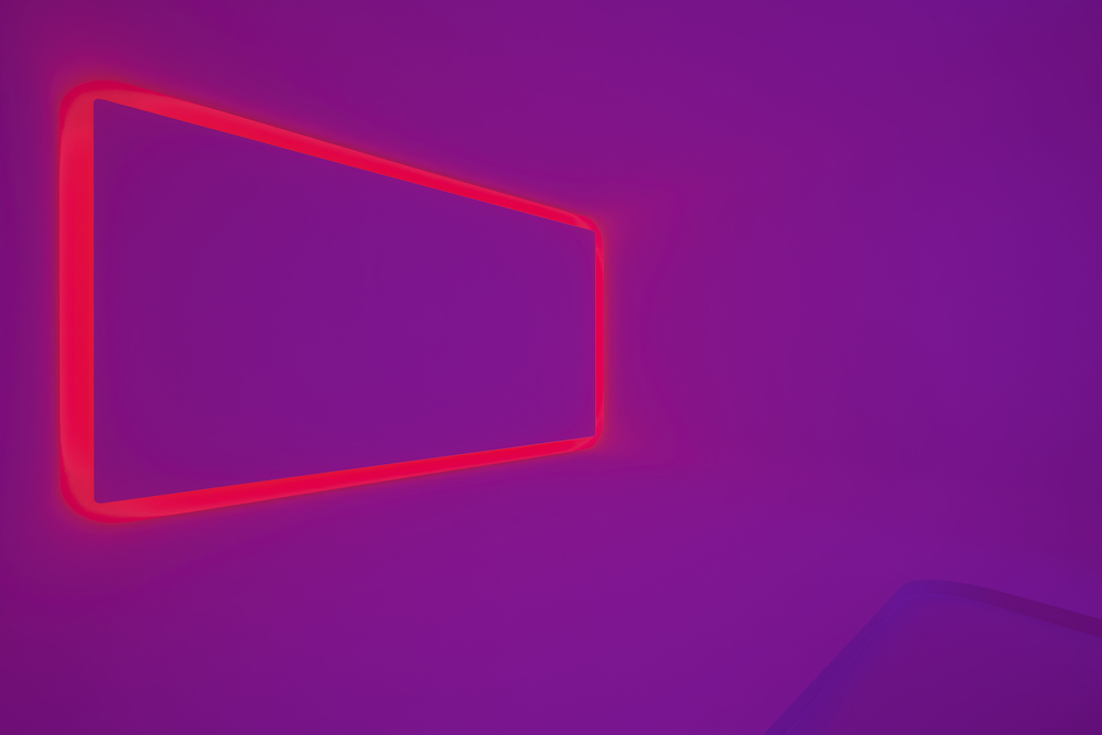
“I am very much taken to how light works in crystal,” says Turrell in an announcement. “Umbra is about the light that is in the soft shadow. In a lunar eclipse, you have the soft light as opposed to the very strong light that you saw reflected off the moon. This is a kind of light that is very soft and filling that I love. If you are looking at this piece, it is not about the light that surrounds the edge, it is the large expanse or panorama of this very soft light that actually comes from the reflection in the room.”

The Turrell and Swarovski pairing is an apt one at least, not only in the attention to detail but also in the likemindedness between both company and artist. “He doesn’t work with everybody,” shares Carla, “we are very honoured that he’s worked with us.” It was a harmonious discussion as to what would be included in the installation, wherein both sides deliberated the medium that would best fit the space and purpose of the artwork. “It turned out that Shadow Space is the perfect one for us,” she adds, taking into consideration the size and audience experience. “We said, ‘what colours would you like to use?’ He said how it was a surprise.” Causing no moment of hesitation or worry – it’s James Turrell, after all – there couldn’t have been a more suited and enjoyable outcome. This is a thought reciprocated from both sides. “He was very happy with the output because most of his forms are made to be temporary,” adds Carla, “so the quality of the room here is so perfect. It’s like approaching an artwork or a picture that will not go away. He was so impressed by the quality of the room because he’s never experienced it so precise.”

Acid Coral Template

Tuomas A. Laitinen addresses important questions of ecology and climate change through a series of glass-made structures and installations

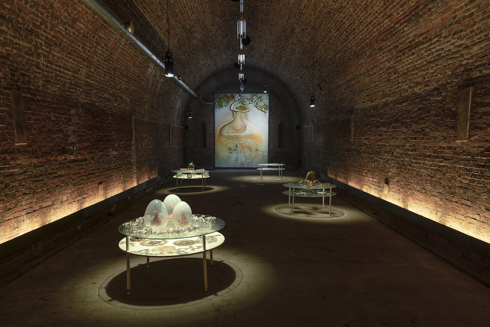
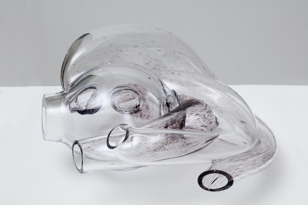
A Proposal for an Octopus, series, 2019. Photo: Jussi Tiainen

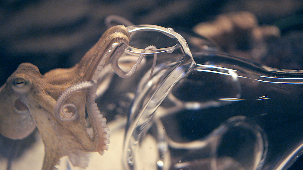
The octopus has earned a spot as perhaps one of the most visited subject matters in art. From 19th century Japanese erotica through to modern painting classics, the eight-armed sea creature has drawn many artistic practitioners in with its alluring symbology and anthropomorphic influences. Mysterious, intelligent, adaptable and fluid; the tentacled and unpredictable animal represents both wisdom and strategy. For instance, in the recent documentary My Octopus Teacher, we saw the ocean protagonist cover herself with shells to hide from impeding prey, outsmarting the sharks in an instant as she continued to poke her many legs into its gills. So it’s no wonder the octopus has caught the attention of artists and designers over the years, with Tuomas A. Laitinen being the most recent – an artist who works across video, sound, glass, algorithms, plus chemical and microbial processes.

In his most recent body of work Tuomas merges the line between art and science, weaponising materiality and craft to take a crystallised view at the world of ecology – that which is done so through octopus-shaped glass structures and compositions. The work, named Acid coral template, has been presented at the inaugural Helsinki Biennial this year, and he’s also recently been commissioned by Daata to create an AR artwork for the launch of the platform’s AR app – a continuation of what was first commissioned by Daata in 2020. “I had been researching protein crystallography for a few years and started to think about how I could translate this data in my work,” he tells me. “In that video work, I used the protein models to create these very baroque body augmentations for the animated characters in the video.” Simultaneously, at the time of making, Tuomas was working on coral growth simulations and eventually these two worlds collided. “The protein model for this particular coral is based on the Yersinia Pestis (plague) bacterium. So there is a weird fictional metamorphosis woven into the fabric of the work. A bacterium becomes a speculative coral. It’s not really about representing the data as such but making an interpretation, a translation, or a transmutation of it and consequently placing it into new environments through AR.”

PsiZone, 2021. Installation view, Helsinki Biennial

Tuomas grew up in a small Finnish town, a place known the centre point for glass production in Finland and in the 20th century. He started working on his installations as a teenager using junkyard materials and scraps, “so that was my fist touch to art, even though there were no such categories in my mind then,” he says. After a stint in music, Tuomas decided to attend art school and pursued his studies at Finnish Academy of Fine Arts, which is where his love of sound, moving image, 3D animation, light and installation first bloomed; his debut glassworks were created around 10 years ago and “were basically custom lenses for a camera”, while his first augmented reality piece was borne in 2016. Now living in Helsinki, he often works with various artists and researchers to question the role of ecology and production, often employing a profound mix of translucent materials such as glass and chemicals, as well las microbial processes and algorithms. 
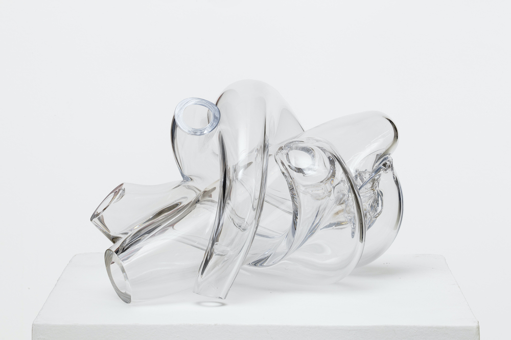
For the last five years, Tuomas has turned his focus onto the eight-legged creature and its home: the coral reef. “I’ve been making glass sculptures for octopuses as an attempt to find ways to think with these extraordinary lifeforms and, on a larger scale, ocean ecosystems. The octopus started to feel like a relevant conductor for opening up various ecological questions, providing a tentacular and modular model for organising ideas and artworks: ‘nine minds’ in one body. There is always a core brain there, but the structure allows a certain decentralisation to happen.” In a wider context, Tuomas strives to question ecology but also to touch upon the various mythologies that are attached to it, “and ideas coming from processes of knowledge production.” He adds: “And in some way, an element of cli-fi and sci-fi is present in the entanglements of my work – especially climate fiction, where the weather or the ecosystem is often seen as a protagonist. The current path in my work started in 2010 when I discovered some key texts from feminist new materialist theorists. That moment presented a major shift in perspective, and it is still affecting a lot of my work.”

Haemocyanin, 2019. Still from the video

And now, when thinking about the relationship between ecology and sustainability, it’s universally thought of as a delicate and necessary relationship. Conserving the earth’s waters, soil and ecosystem is vital in order to remain harmonious with the environment and the incoming – or better yet the present – affects of climate change. Tuomas’ work not only proves the impact of art when it comes to raising awareness of climate change, but that it’s a an aesthetic reminder of how fragile the natural world can be, where with just a shudder, slap or bash it can break it into tiny fragments. 

“For me, the idea of ecology is something that emerges from being sensitive to processes of mutual coexistence,” he explains. “When I think of ecology, I often come back to the notion of overlapping symbiotic processes and questions of biodiversity. At the level of making art, it means that individual works (like this coral reef) emerge out of an extensive world building or thought process rather than clearly defined project boundaries. A certain bundle of actions and reactions allows a specific outcome or a life form to appear, and I think that this is a sort of a parable of an ecological process. Feminist theorist Deboleena Roy talks about this notion of ‘feeling around for the organism’ in her book Molecular Feminism, and it’s been one of the important reminders on how to look for kinship with other-than-human lifeforms. And then, on another scale, as a citizen concerned with environmental issues, I am trying to find ways to support youth climate actions, but on an artistic level, it’s all about these subtle differences and tentative approaches.

It seems to me that understanding different scales and the resulting perspective shifts are quite crucial tools in relation to thinking about ecological transformations.”

A Proposal for an Octopus, series, 2019. Photo: Jussi Tiainen

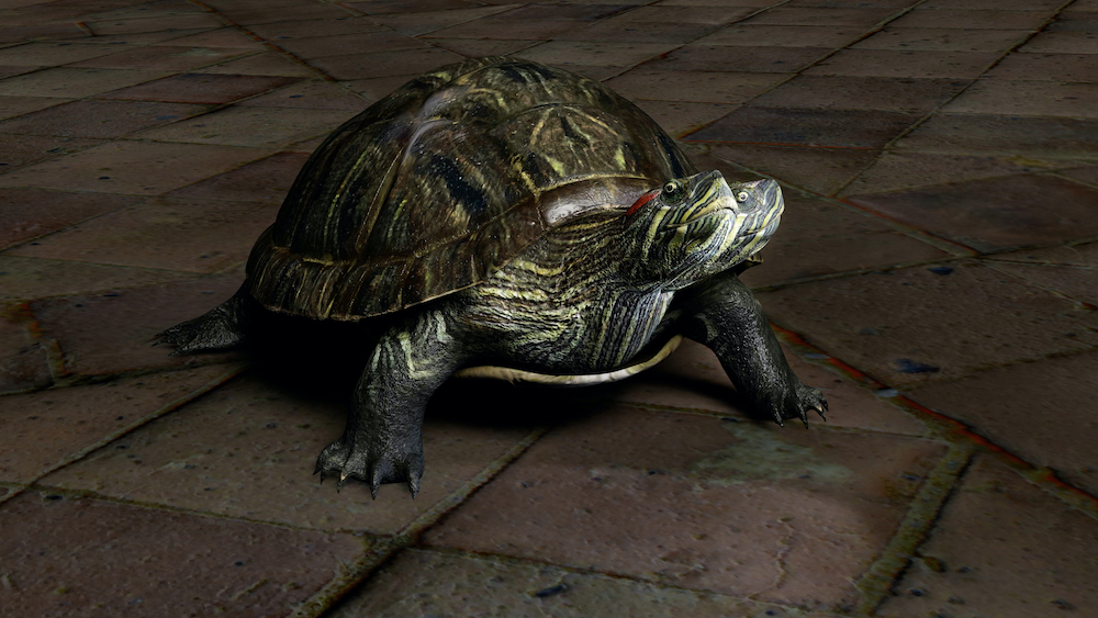
Protean Sap, 2020. Stills from the video

The Same Sea

Port takes a trip to the Finnish island of Vallisaari for the Helsinki Biennial 2021

©Matti Pyykko, Helsinki Biennial

A group of 330 islands conjugate around the coastline of Helsinki, establishing an untrammelled and easy getaway from the humdrum of city life. It’s normal for locals to boat around here, whether that’s in lieu of the sauna, work or heading home from the mainland. Life in the Finnish capital feels serene, and the calm streets of the more urban environments – free from any queues – only solidifies this as a place where happiness, nature and the environment matter above anything else. 

While leaving the port of Helsinki on a refreshingly crisp day – the locals explained it was unusually cold for the time of year – that’s when I first caught sight of the many tiny islands, most of which are decorated with a wooden hut or left untamed and completely wild. Some are homes, others are summer houses or places to soak up the heat of the sauna. Then there’s the rocks, poking out of the water with abnormally smooth edges; they sink into the sea bed with little effort, windswept and altered by the tectonic shifts of the surface below. It took a mere 20 minutes to arrive at our destination of Vallisaari, an enchanting island and home of the Helsinki Biennial – an event presented by Helsinki Art Museum (HAM), directed by Maija Tanninen-Mattila, and curated by Pirkko Siitari and Taru Tappola.

Making its debut on the island with 41 artists from Finland and across the globe, the biennial’s new location is a land that’s diverse and rich in its formation. Few people could have entered Vallisaari a handful of years ago, due to it being used as a military base for the Russian Army – the remnants of which are still astonishingly present today. With a title of The Same Sea, the works involved in the biennial’s festivities reflect on the island’s history, as well as the interconnectedness and dependence that the world has on its oceans. With the climate at the fore, this is highlighted immediately as you board the island, where visitors are stunned by the confrontational work of Finnish artist Jaakko Niemelä’s Quay 6 (2021) a large, red structure that cups the shore line as it explicitly denotes the impending threat of rising sea levels. Below, I round up a few key highlights from the event, consisting of sculpture, sound and installation that each reflect on our climate emergency. 

Jaakko Niemelä: Quay 6, 2021 ©Maija Toivanen/HAM/Helsinki Biennial 2021

Jaakko Niemelä: Quay 6 (2021)

Designed as the island’s greeting, Jaakko’s installation has been construed of scaffolding, painted wood structures, water pipe and pumps. Commenting on the drastic effects of climate change and how the rising sea levels will greatly affect our lands and civilisation, the alarming piece directs its focus onto the melting of Greenland’s northern ice sheet; if it were to disappear in entirely, then sea levels will rise to six metres – the height of the structure.

Teemu Lehmusruusu: House of Polypores, 2021 ©Maija Toivanen/HAM/Helsinki Biennial 2021

Teemu Lehmusruusu: House of Polypores (2021)

A hybrid of natural processes, research and sound, the Helsinki-based artist’s installation is given anthropomorphic qualities as it listens to decaying trees before converting the noise into music. The work is likened to an instrument made of soil, and visitors are invited to touch and place their ears onto the large tubular structures to listen to its deep and vibrating hum. There are four structures in total, each of which is crafted from mushrooms, electronics and decaying wood. 

Margaret & Christine Wertheim and the Institute For Figuring: Helsinki Satellite Reef, 2021 ©Maija Toivanen/HAM/Helsinki Biennial 2021

Margaret & Christine Wetheim: Crochet Coral Reef, The Helsinki Satellite Reef (2021)

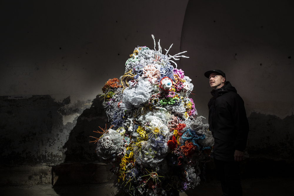
The world’s coral reefs are depleting, suffering greatly from pollution and heat exhaustion as a result of climate change. This handmade crochet piece, crafted by two LA-based sisters, is a passionate response to the matter; it reflects on the long process of building the sculptures as well as the lack of time that animals (and the reefs) have on our planet. The project has travelled to New York, London, Riga and Abu Dhabi in engaging with more than 10,000 participants; the sisters will also work with local Finnish communities to crochet a reef in Helsinki.

Janet Cardiff & George Bures Miller: FOREST (for a thousand years…), 2012 ©Maija Toivanen/HAM/Helsinki Biennial 2021

Janet Cardiff & George Bures Miller: Forest (for a thousand years…) (2021) 

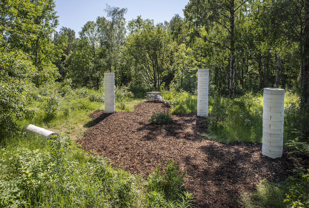
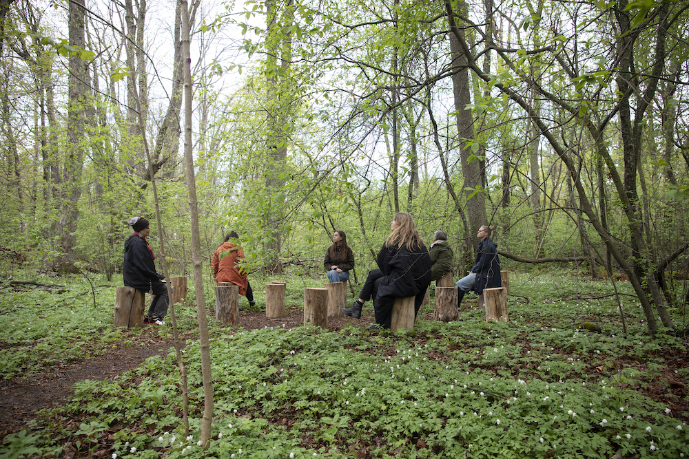
In a calming corner of the island’s woodland, an immersive sound installation encourages its visitors to perch on tree stumps as they listen to various sounds: aircrafts flying above, birds, explosions and choir song. The Canadian artists’ work comments on the sounds that a forest will hear in a lifetime and, in this case, the different points in history for Vallisaar. Its listeners are exposed to yelling, screaming and gun fire, but equally they are connected to the trees around them, personifying nature as a delicate and fragile entity. 

Lutfi Janania

The Honduran-born botanical artist creates objects and sculptures coined from the natural world

The Central American country of Honduras is rich in flora. So immense that it runs miles, canopied amongst mangroves, cloud forests and long lines of coast stretching across the Caribbean Sea, to the north, south and Pacific Ocean. It’s marked by high and rainy mountainous slopes of the country’s highlands, dense in oak-pine forests and delicious woodlands that spreads for valleys upon valleys. Yet despite its vast occupancy of luscious lands and lively fauna that inhabit it, Honduras has also undergone some dramatic environmentalist issues. This includes the loss of soil fertility and soil erosion, plus the depletion of forests where trees have been harvested for lumber, firewood and land. Its fragility is only increasing, but it’s also these very pines, leafs and flowers that serve as a delectable backdrop and inspiration for one particular artist working today, Lutfi Janania.

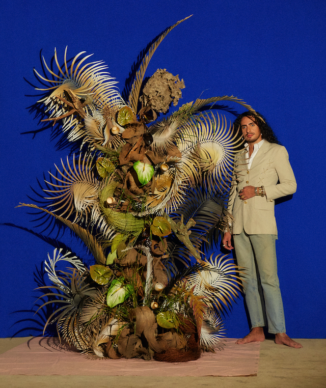
Lutfi is a Honduran botanical artist who was raised amongst the rainforest and mountains of San Pedro Sula. After emigrating to New York City, the artist was in search of a new utopia – one comparatively different to the green facades of his upbringing. And, in doing so, he started working in the fashion industry whereby he learned about construction, colour and texture; the key elements to his work now. A few design roles later, and he finally ventured out on his own as a stylist, working on editorials and employing the use of flowers within the backdrops and more subtle accents of the shoots. This is the moment when he realised he’d found his utopia, or better yet his “passion for creating fantasy through experiences that could be harnessed through botanical design,” he tells me. Naturally, this led to the launch of his own design studio, Rosalila, during which he works with botanicals to build objects, sculptures and installations.

Corallia. Shot by: Maksim Axelrod

“I live for the idea of creating a fantasy, transforming a dream into reality,” he continues, noting how this was fully harnessed once he’d moved to the USA. “I imagine it as materialising an enchanting and otherworldly environment and the creatures that live in it.” Through freshly cut tropical plants used in installations through to various assortments of trimmings and flowers, Rosalia is indeed a “fun, flirty, exotic yet very elegant” outlet for his goals and view of the world. “Think of that sensation when taking in the lively rays of sun in the tropical beaches of Honduras while holding a delicious spicy margarita in your hand.”

Lutfi’s reasons for venturing into the field of botanicals stems wholly from his past. His familial home, for instance, is located on a nature preserve, built by his grandfather amongst the wild forest. Describing the environment as being “literally Jurassic in size”, Lutfi had the entire ecosystem at his fingertips. “The trees tower over my house and provide habitat for a variety of tropical birds and giant variegated monsteras, and other plants which climb and drape all over their entirety. Coming of age in such company really shaped my understanding of colour texture and light.”

The typical compositions of a forest tend to be centralised, as the plants reach for the light in their journey to photosynthesise. Lutfi’s work, however, completely defies the laws of gravity, and of the rainforest for that matter. He relies steadily on light, weight, balance and, of course, gravity, to stretch and spread his pieces to achieve questionable angles. Reaching branches are paired with dried florals, “which seem to simultaneously bloom and weep”, while curved woods and obscure silhouettes are formed through the skill of finding stability within his striking sculpture pieces. It’s an art form in itself.

Looking inwards, and beyond the outer layer of wildness and beauty, you’ll notice how Lutfi’s structures are more than just a display of expansive nature. He picks his materials depending on the stories that they speak, especially those that tell tales of their homelands. “And because of my upbringing in the bioreserve of Honduras, my relationship and experiences with the natural world have led my inspiration to be often rooted in nature,” he explains, weaponising both permanent and sustainable objects in order to reach the studio’s environmentally conscious goals. “At Rosalila, we have a conscious practice; we don’t believe in a wasteful way of designing. We repurpose our materials, pushing their limits and boundaries.” 

Leafy Sea Dragon. Shot by: Leon Hernandez

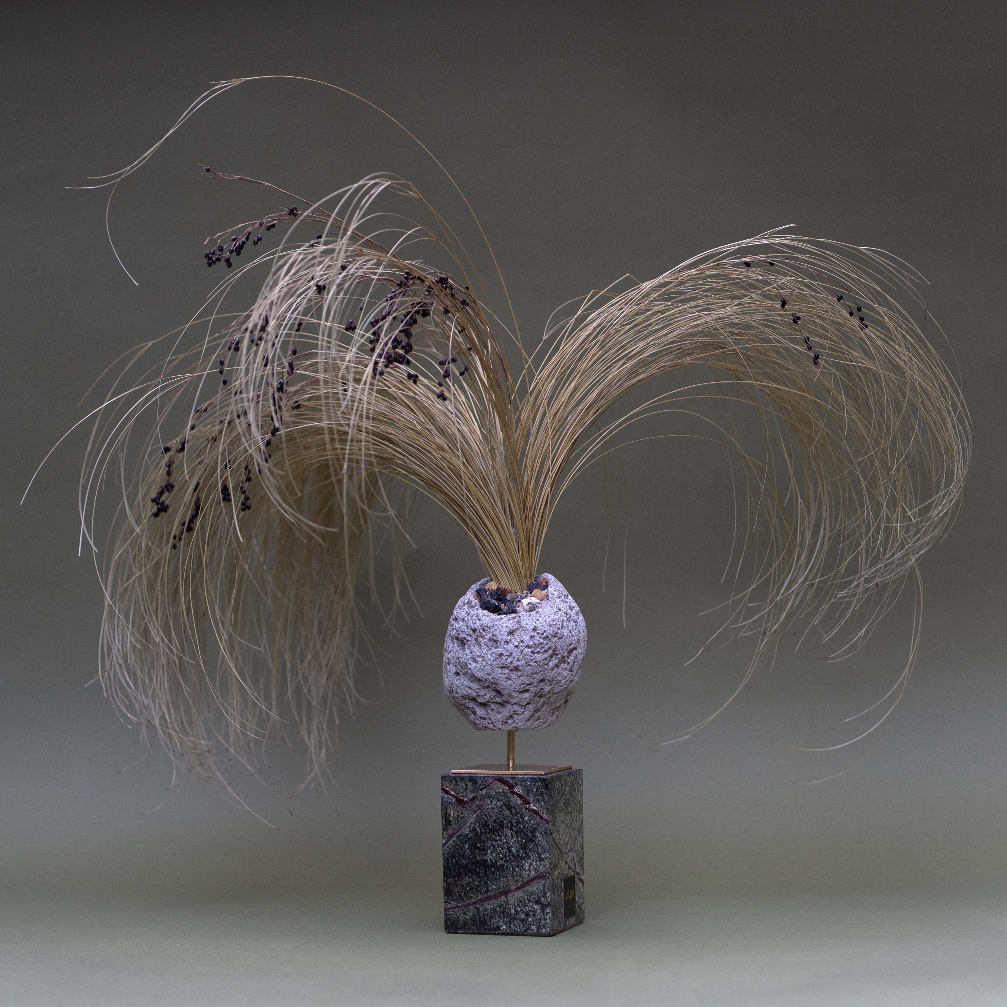
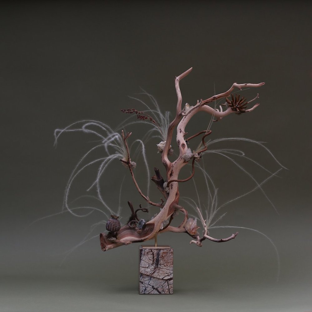
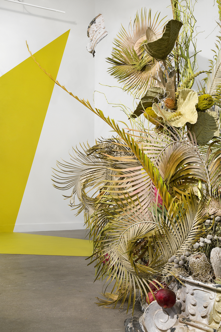
The Leafy Sea Dragon sculpture embodies this entirely, as its’ construed of hand-preserved botanicals, manzanita wood branches and crystals. “The piece explores negative space, grandeur and fantasy with an emotional connection,” adds Lutfi, who collaborated with a family-owned fabricator in Queens to create the Italian rainforest marble base, and a Brooklyn-based metalworker in Brooklyn to weld the brand stand, before adding in the botanical work crafted by the studio. It’s an immeasurable piece with strands and spikes alluding to the ever-growing quality of nature; punches of pinks are tossed amongst the desolate, earthy tones of the environment, causing a fiery juxtaposition of fertility and sterility that plausibly takes a stand against the dwindling lands of the rainforest.

All of Lutfi’s pieces encompass a myriad of materials, be it marble, quartz, brass, manzanilla wood, curly vines and hand-preserved botanicals. And through the marriage of the man-made and natural, his pieces are greatly provocative. “My desire is to convey emotions, feelings and sensations and the dualities in them,” he shares on a final note about the work’s impact. “When compiled together, these vignettes with crooked leaves generate sorrow, curiosity, anticipation and longing. In stirring such emotions, the environment begins to take shape and the life within the work becomes evident. The dried, dehydrated material is not just preserved, it’s persevering and actively creating. What appears to be dead is very much alive.”

Portrait in front of sculpture. Shot by: Ricardo Rivera
The Mirror. Housed by: @Ashya.co. Shot by: @equatorproductions
Corallia. Shot by: Maksim Axelrod

Julian Rosefeldt: An Artist’s Manifesto

Port speaks to director and artist Julian Rosefeldt about his film Manifesto, a meditation on modern artistic manifestos in which Cate Blanchett plays 13 different characters

FLUXUS / MERZ / PERFORMANCE, Manifesto © Julian Rosefeldt

Julian Rosefeldt’s Manifesto, a feature length film derived from an art installation of the same same name, is a tough sell on paper. The film is divided into thirteen sections, each with a different main character played by Cate Blanchett (a la I’m Not There, in which Bob Dylan is embodied by six actors, including Blanchett) who recite excerpts from over fifty individual manifestos of art, from Dada to Dogma 95. Alongside a touring exhibition of the sections simultaneously projected onto separate screens in an overwhelming sensory soundscape, the more conventionally structured film of Manifesto, in which the sections are stitched together into a 90 minute feature, premiered at Sundance Festival in January, and has its general UK release later this month.

SURREALISM / SPATIALISM, Manifesto © Julian Rosefeldt

What relevance do these artistic credos, some of which are approaching their centenary, have for people not in the art world? “The art world is a bit of a closed circle,” explains writer, director and producer Julian Rosefeldt from his home in Berlin. “We’re imprisoned in a white cube where we always speak with people who don’t necessarily have to be convinced, because they agree with everything we have to say already. We consider these important issues, but we don’t talk to the right people about them.”

STRIDENTISM / CREATIONISM, Manifesto © Julian Rosefeldt

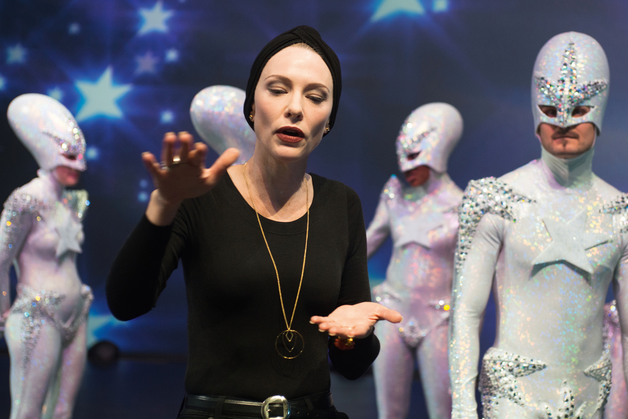
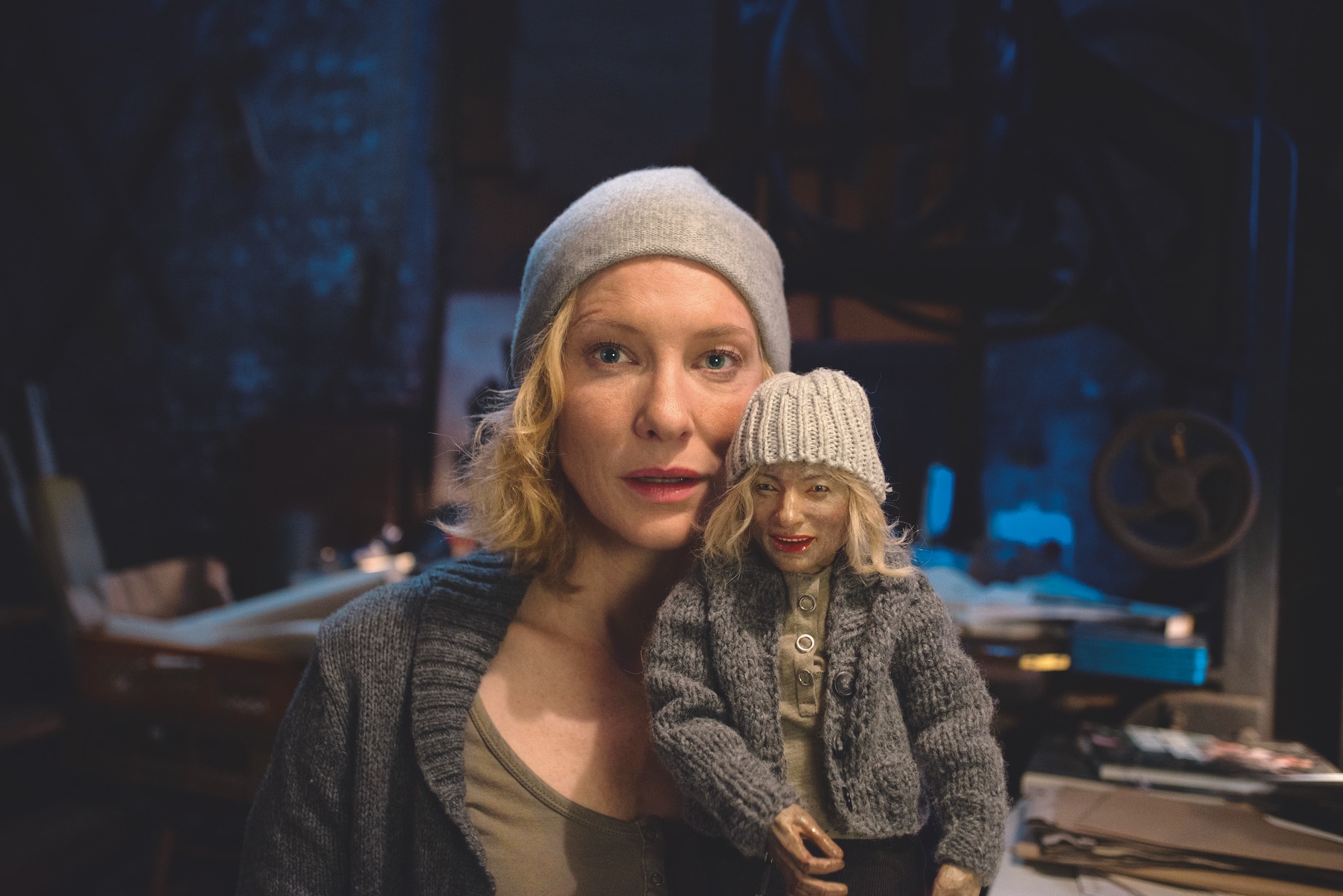
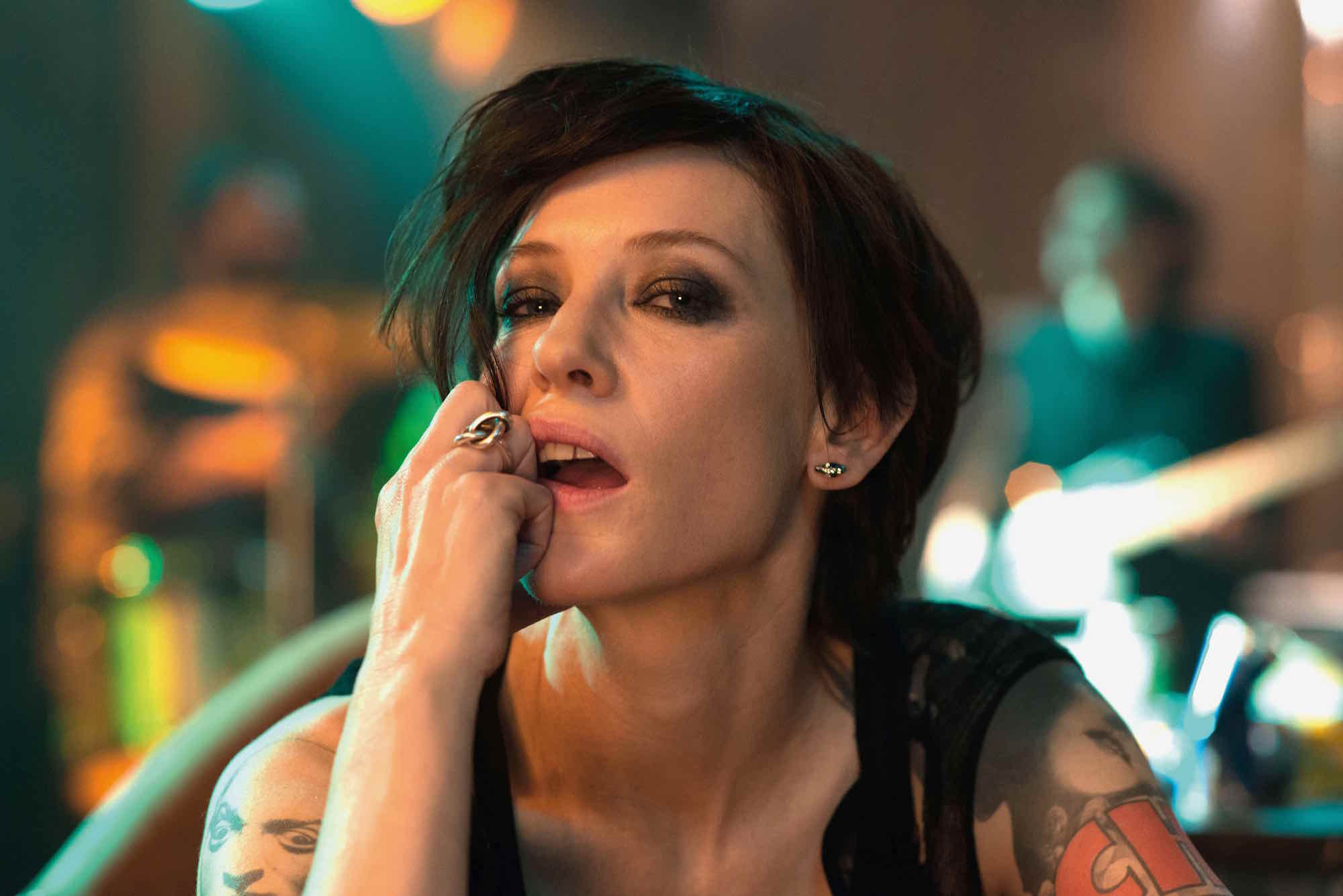
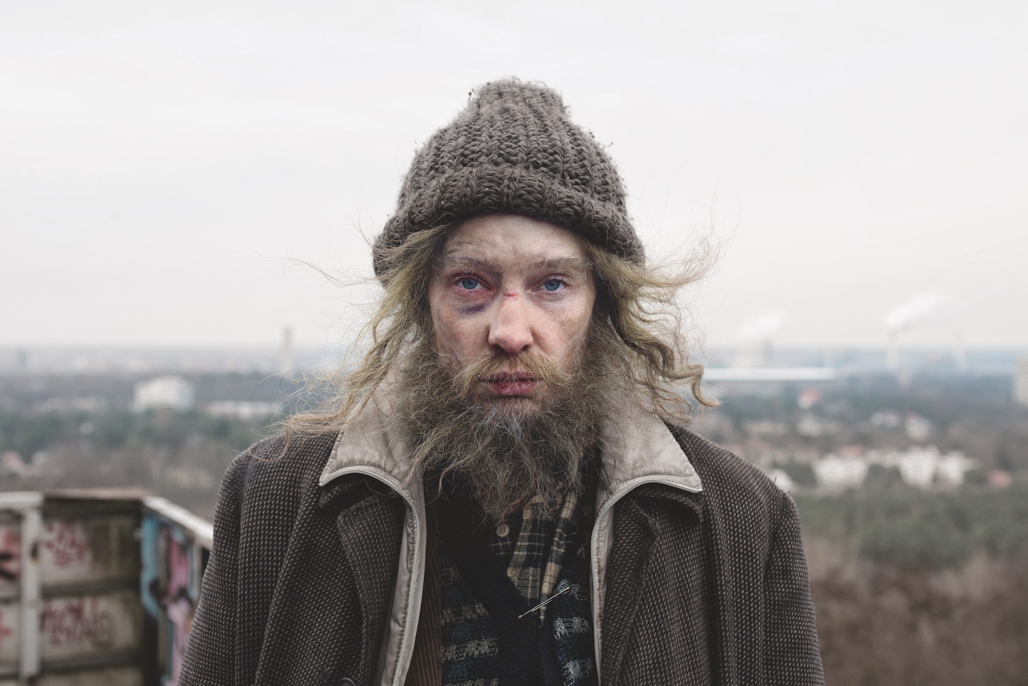
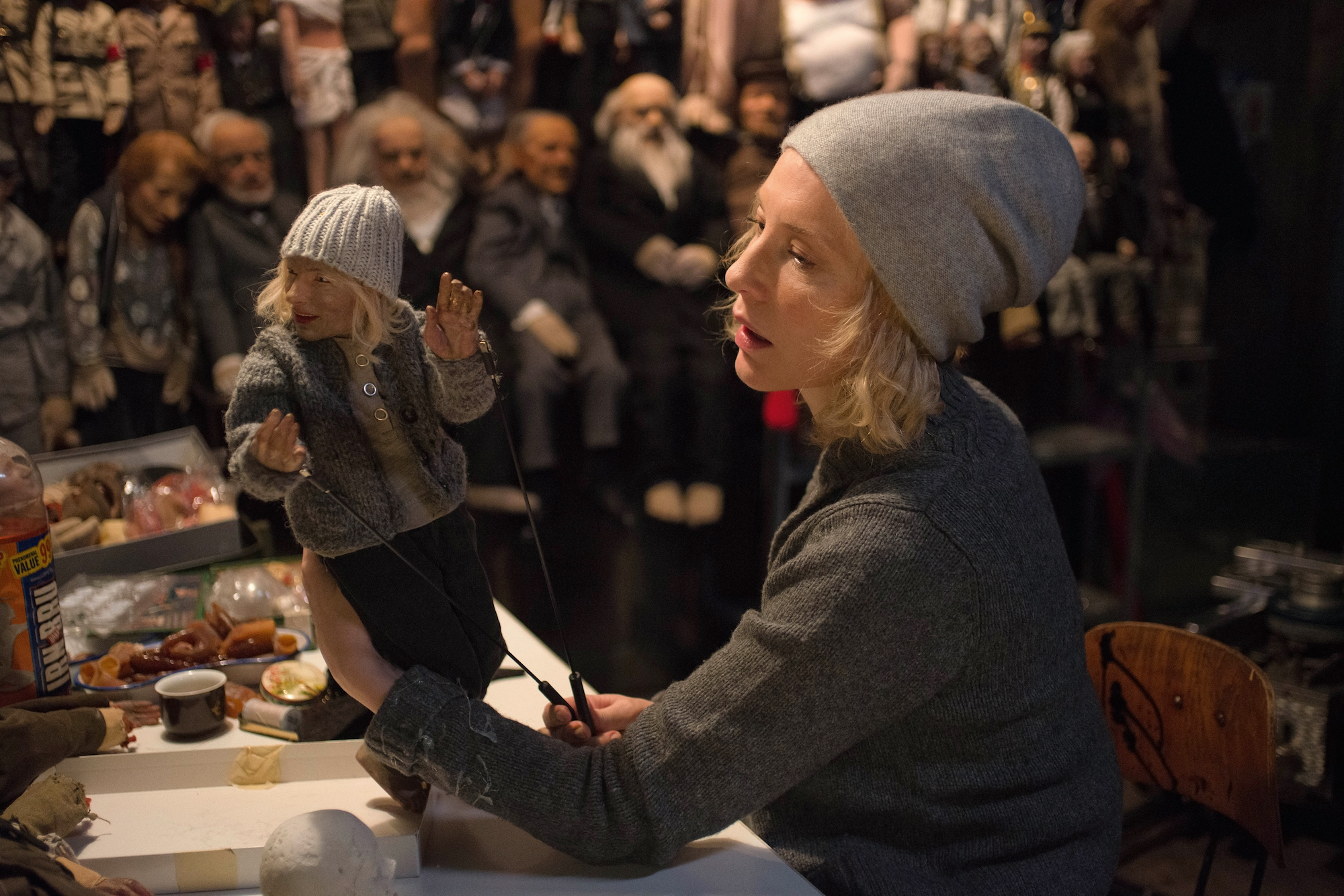
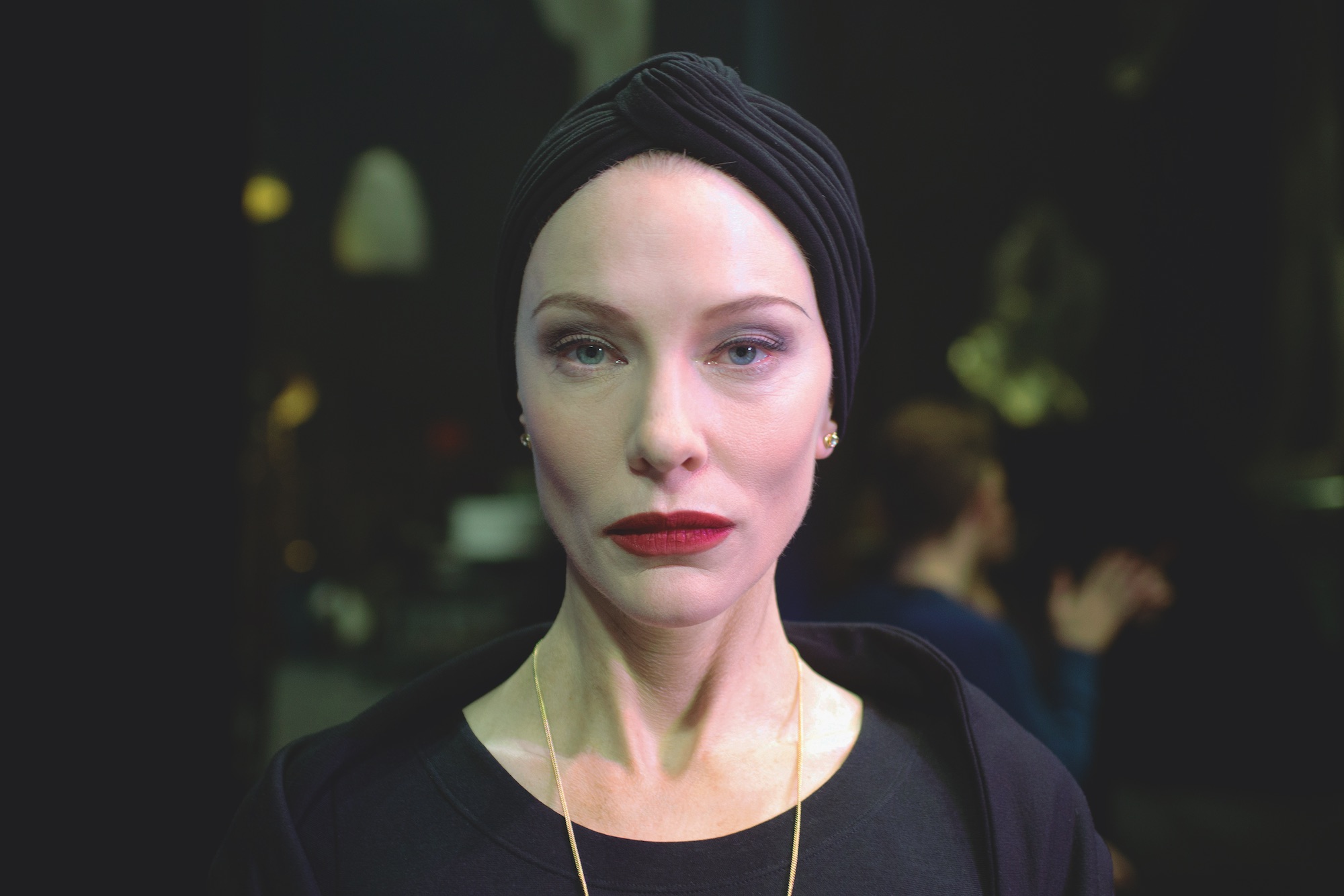
In different hands, this cerebral mixture could easily have produced quite a dry film: one to be cautiously admired, rather than enjoyed. Yet, Rosefeldt and Blanchett pull off the impressive feat of making these scholarly manifestos digestible, comprehensible and almost conversational.  In Blanchett’s portrayal of a dizzying range of characters – including a homeless man, a single mother and a ballet choreographer – century old texts written almost exclusively by dead, white men, go through a certain democratisation. “I wanted to depict a kaleidoscope of society,” Rosefeldt says.

SITUATIONISM, Manifesto © Julian Rosefeldt

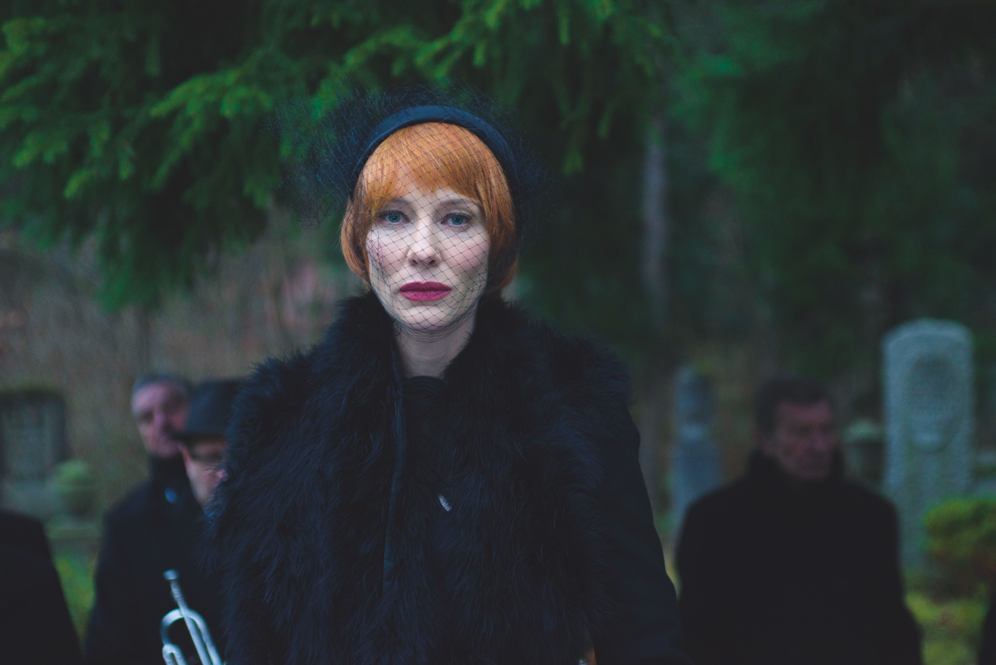
The film is also tonally diverse. The second section features a wild-eyed homeless man, screaming through a microphone with only a post-apocalyptic wasteland to act as witness. This is immediately followed by a stockbroker extolling the virtues of speed and technology that complicated the Futurist movement with overtly Fascist overtones. In Manifesto’s most arresting sequence, Blanchett presides over a Dadaesque funeral mourning (and simultaneously celebrating) the death of art. This scene was filmed in the dying light of a brief winter afternoon in Berlin, Blanchett nailing the eviscerating speech in just one or two takes.

DADAISM, Manifesto © Julian Rosefeldt

This palpable sense of unease and impending catastrophe is punctured by scenes of surprising comedy, such as sculptor Claes Oldenburg’s ‘I Am For An Art’ recited with reverence by a Southern mother saying grace. “I am for an art that is political-erotical-mystical, that does something other than sit on its ass in a museum,” she intones solemnly, her three children and husband (played by Blanchett’s actual family) propped up on steepled fingers around a rapidly cooling Sunday roast.

SURREALISM / SPATIALISM, Manifesto © Julian Rosefeldt

The dashes of humour in the film often arise from such ironic distance between text and situation. A manifesto of conceptual art, parroted by an aggressively made-up, Elnett-haired parody of a Fox News reporter, cannily raises the spectre of fake news: “Good evening, ladies and gentlemen. All of current art is fake.”

CONCEPTUAL ART / MINIMALISM, Manifesto © Julian Rosefeldt

Bar the opening lines from the Communist Manifesto, the texts are artistically apolitical – though between the lines such declarations are always political. “In Q&As after the screenings, people again and again refer to the political circumstances of today”, Rosefeldt explains. “When the first Futurist manifesto was published on the front page of Le Figaro in 1909, it acted as a kind of an ignition, a spark, that infected a lot of artistic manifestos at the time. We are living in a moment that is, in a way, comparable to the tension felt between the wars. The world is upside down and people read in those manifestos a kind of call for action, or an anti-populist call.”

FLUXUS / MERZ / PERFORMANCE, Manifesto © Julian Rosefeldt

Audaciously, Rosefeldt combines manifestos from decades apart in the same section, bringing Wassily Kandinsky (1912) and Barnett Newman (1948) into conversation. “Of course, it’s quite disrespectful towards the original writing,” Rosefeldt says bluntly. “Within these circles there is as much contradiction as agreement. But in art, as in history and fashion, everything repeats itself. Ideas come up, disappear for a while, and then forty years later have their rebirth.”

FILM, Manifesto © Julian Rosefeldt

In the last section, in which the manifestos of cinema’s auteurs including the Dogma 95 duo Lars von Trier and Thomas Vinterberg are coalesced into a lesson, the lively contradiction between different authors is more explicit. Through Blanchett’s earnest teacher, the director Jim Jarmusch writes “Nothing is original” on the blackboard and instructs a class of ten year olds to “Steal from anywhere”; a sentiment that the firmly tongue-in-cheek Dogma manifesto contradicts in the next sentence. “That’s a bit how I remember school,” Rosefeldt chuckles. “From the same person, you get both complete bullshit, and things that actually make sense.”

Manifesto: Live From Tate Modern takes place across the UK on Wed 15 November. Manifesto goes on general release on 24 November. See manifestothefilm.com for full details.